40 Moroccan Color Palettes Inspired by Morocco
|
|
|
Time to read 3 min
|
|
|
Time to read 3 min
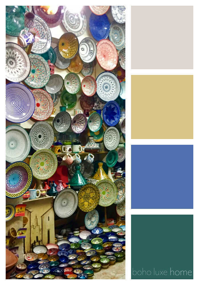
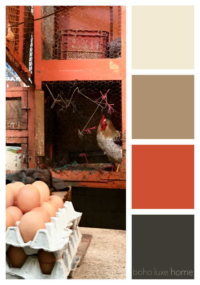
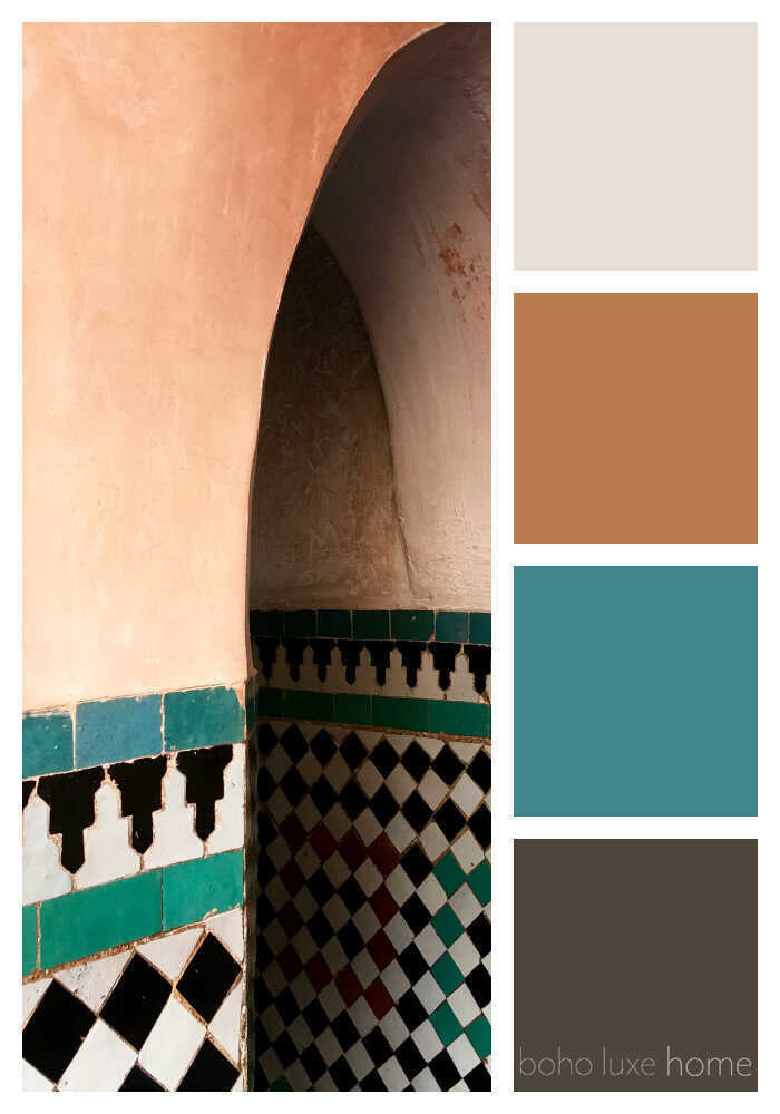
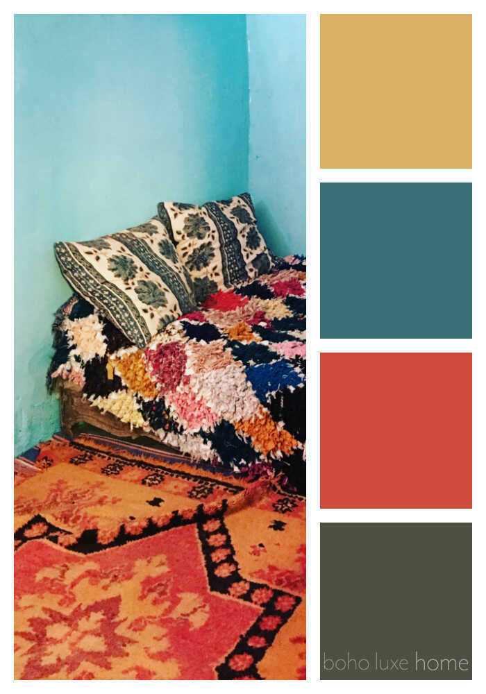
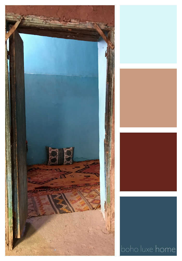
During our recent travels, Morocco’s landscapes, textures, architecture and people inspired us to get creative. Each of these 40 photos from Morocco tells a story – and each sparked its own unique color palette. Use these uniqe color ways to spark your own creativity, whether planning your home decor, your wall colors, your outfit or a graphic design project.
We spent our trip enjoying Marrakesh with seven amazing, creative friends. Base camp for our Moroccan house party was a 16th-century riad just steps away from the souks.
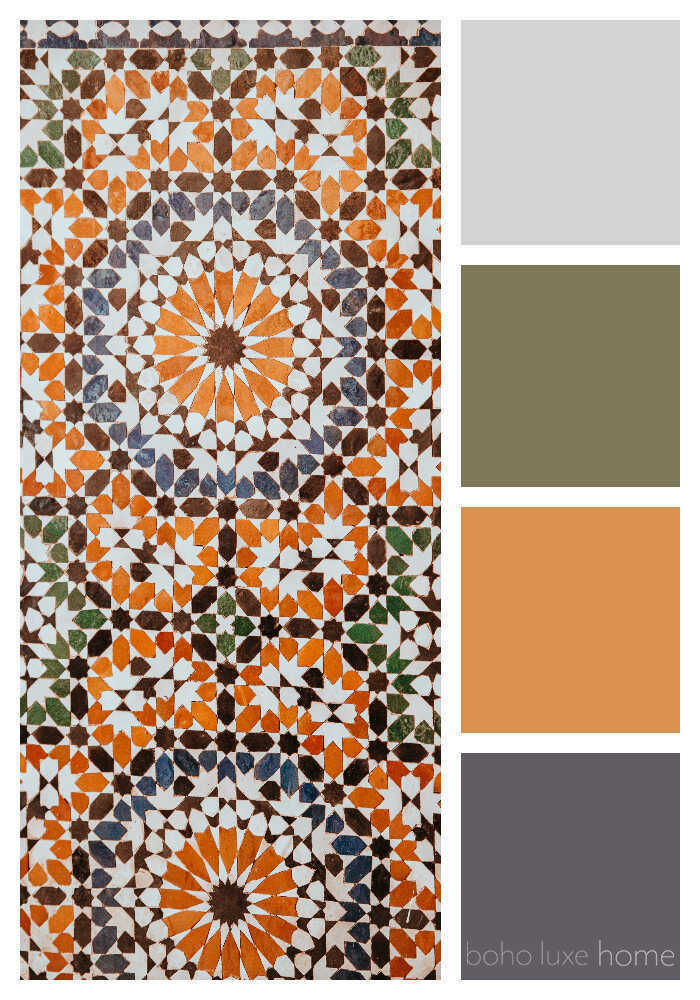
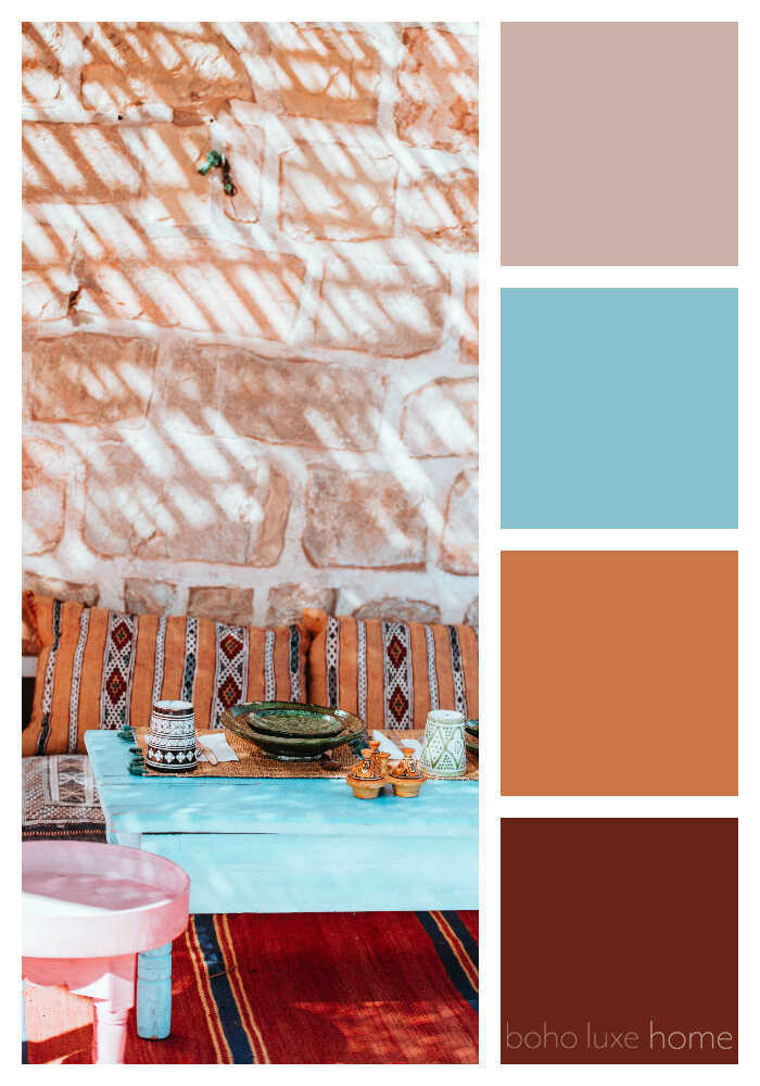
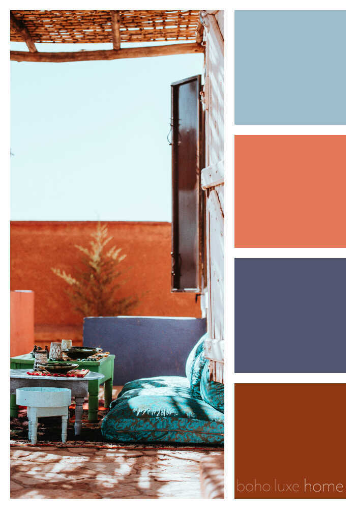
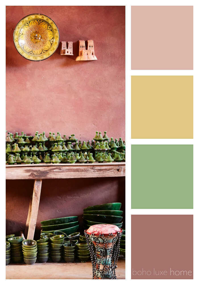
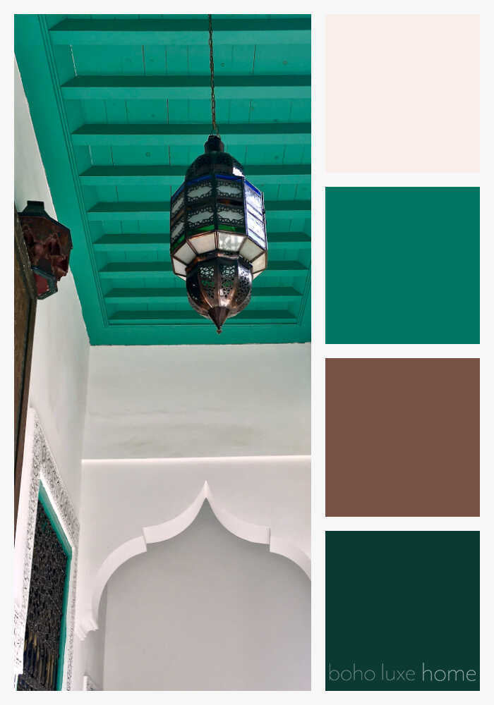
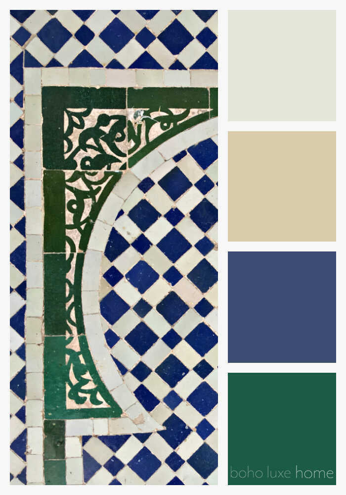
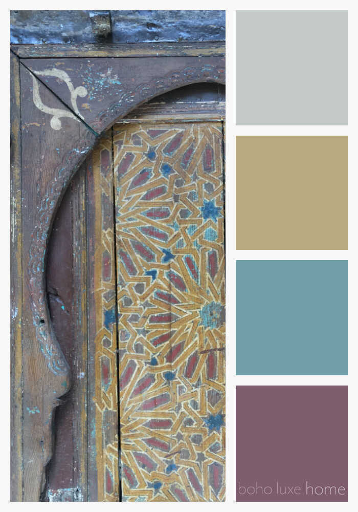
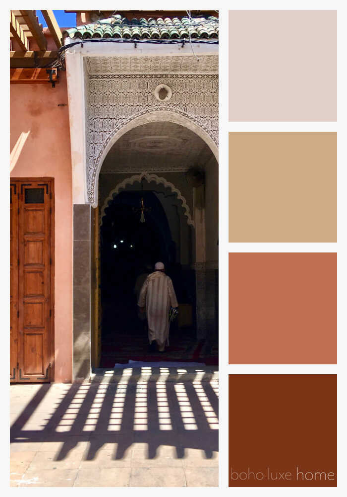
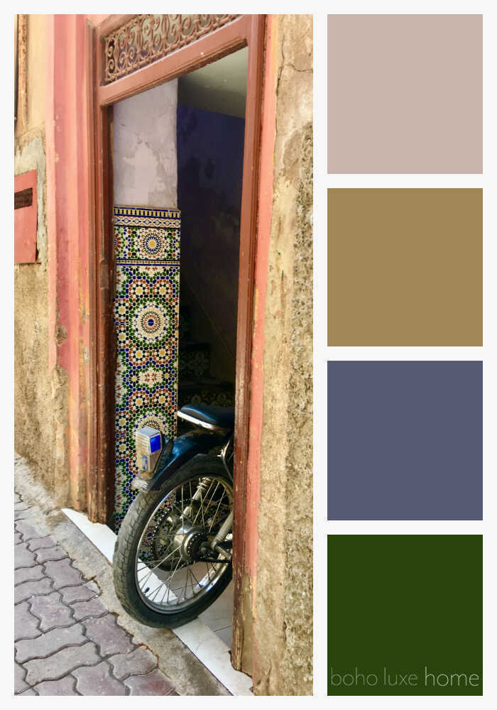
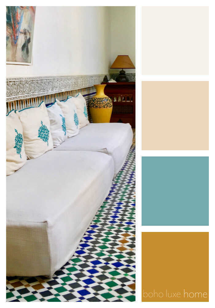
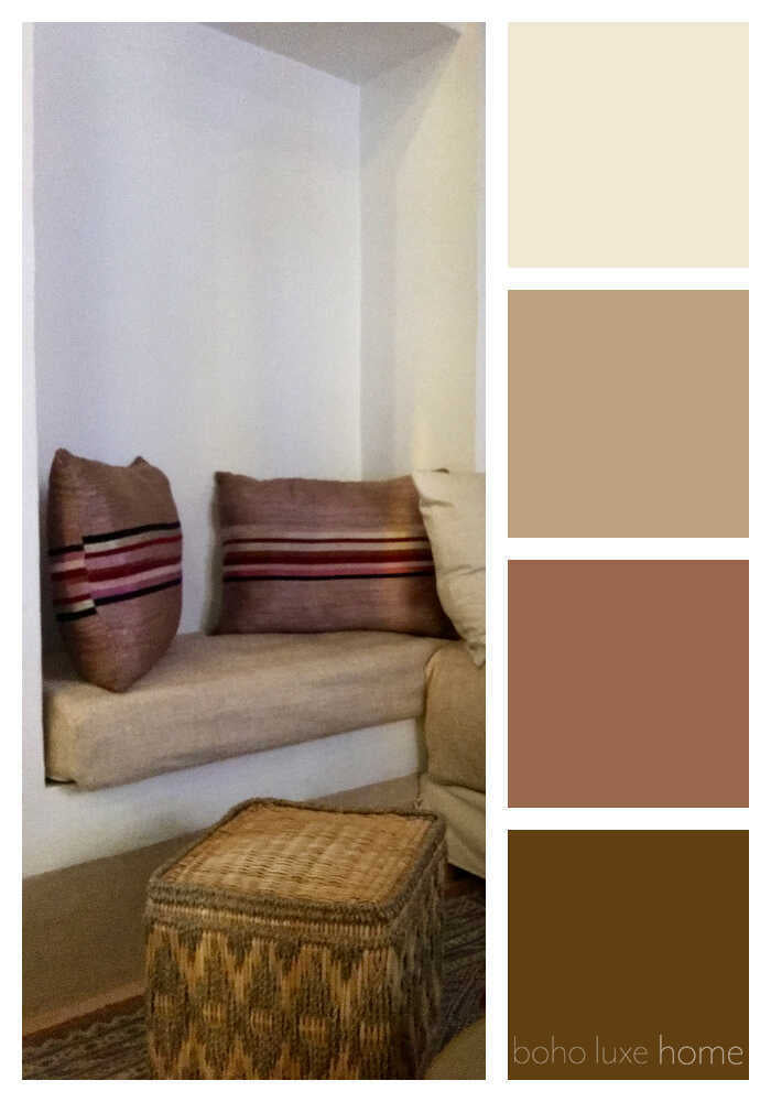
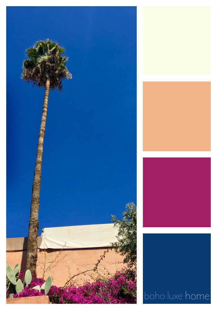
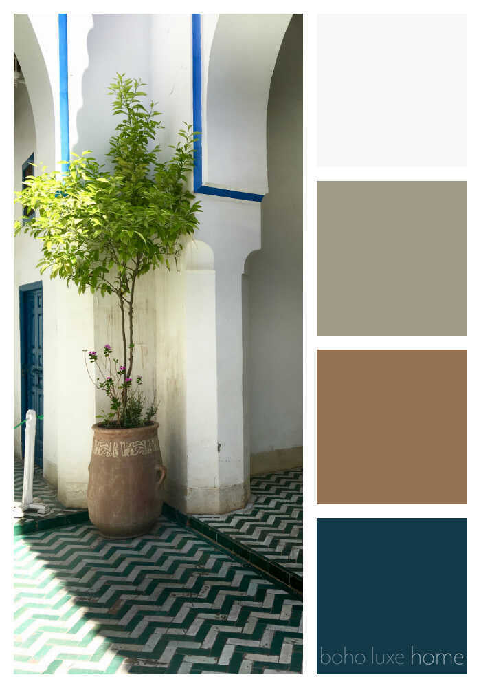
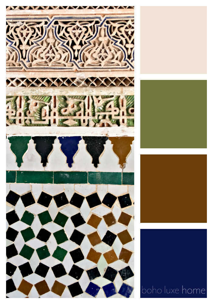
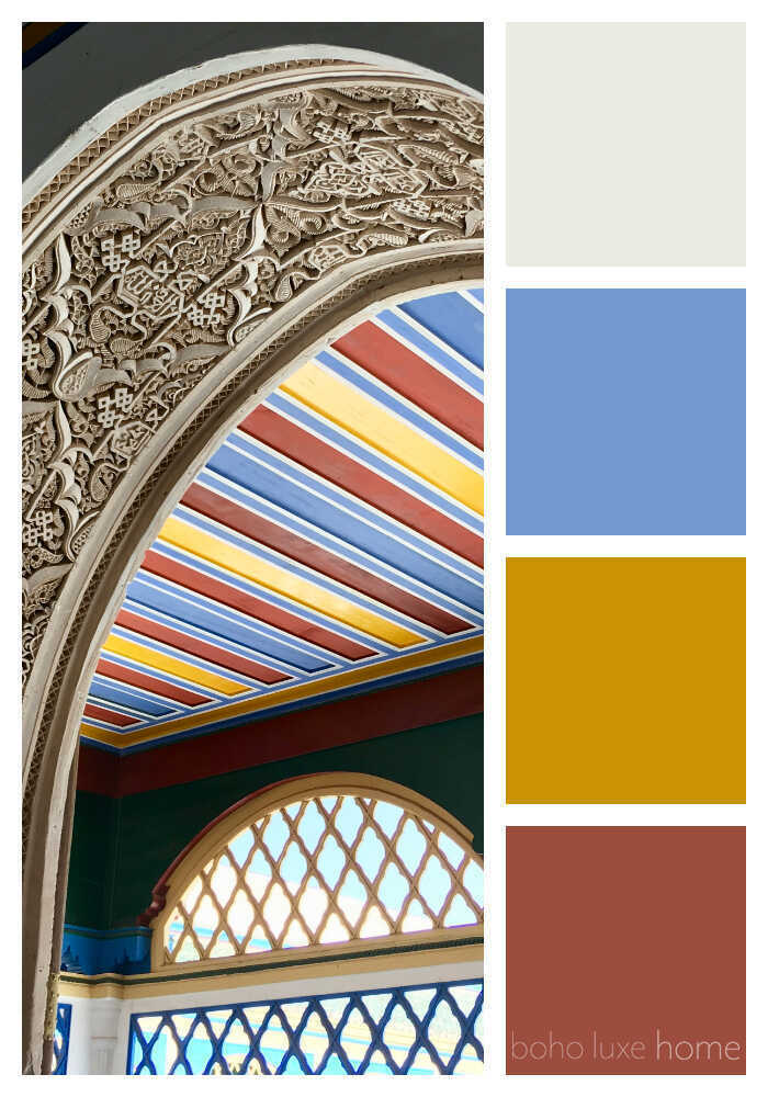
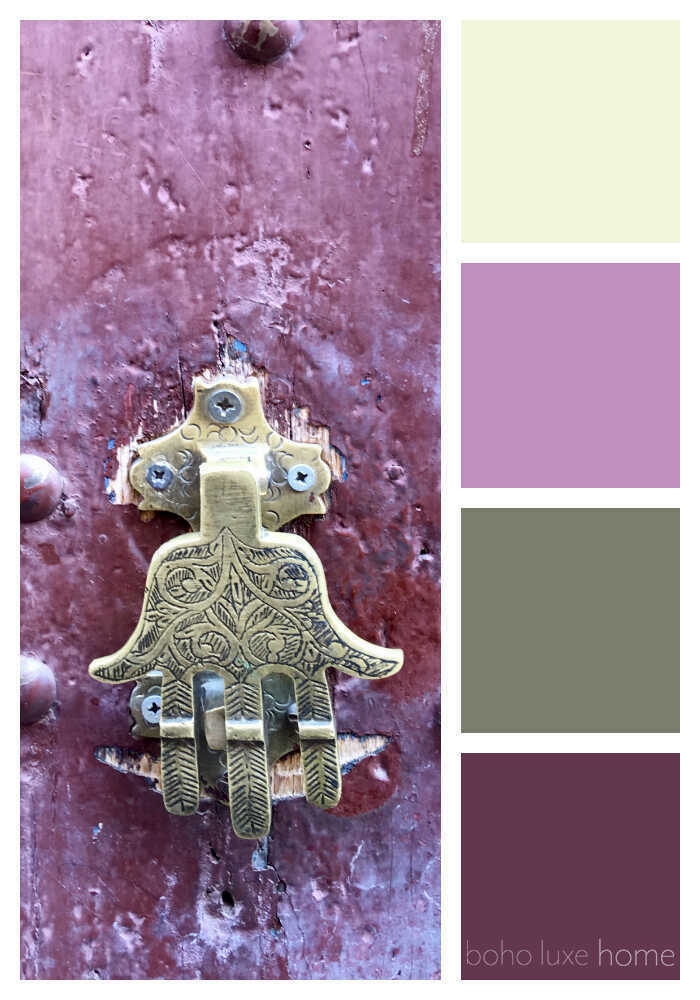
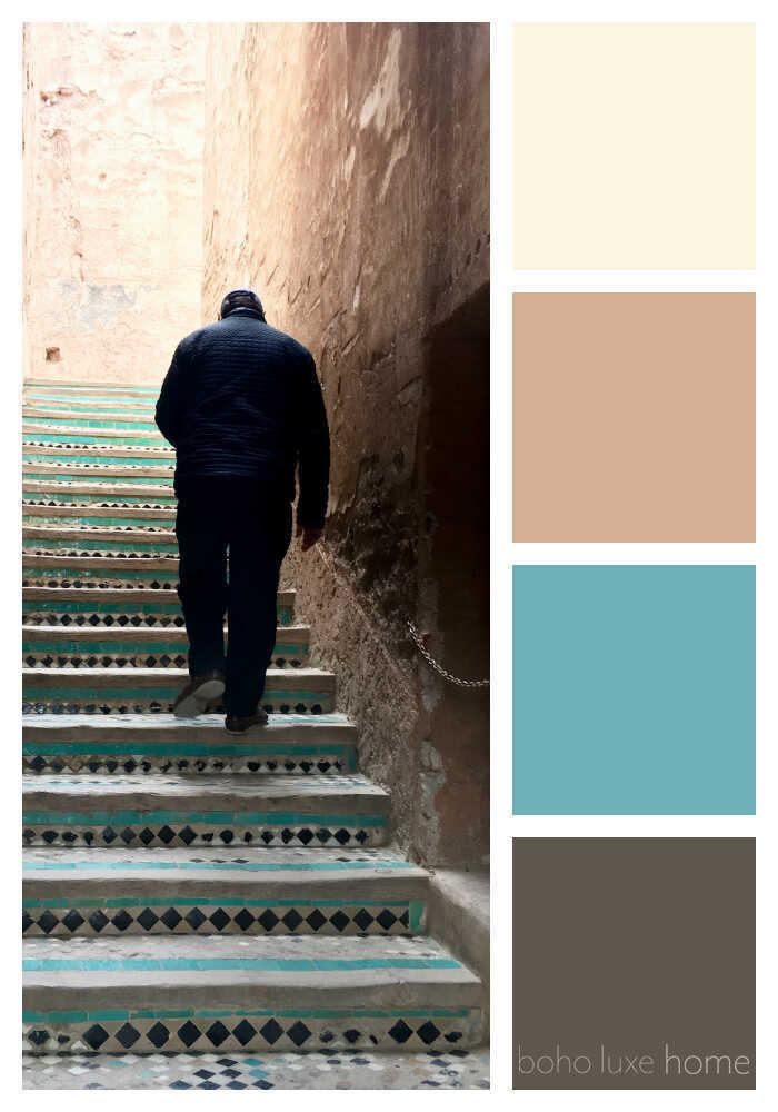
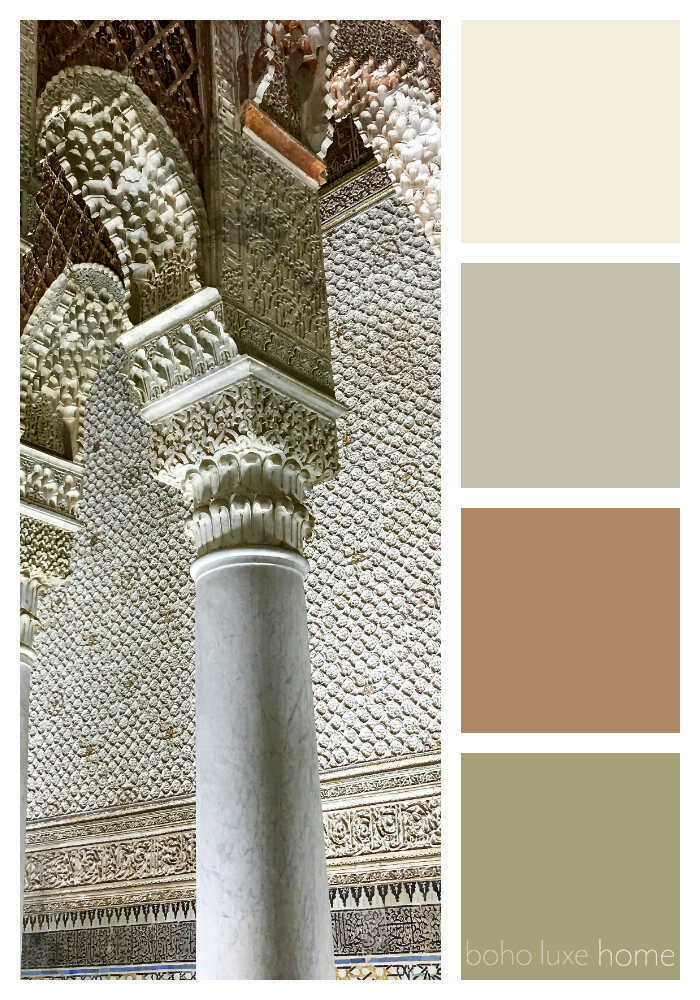
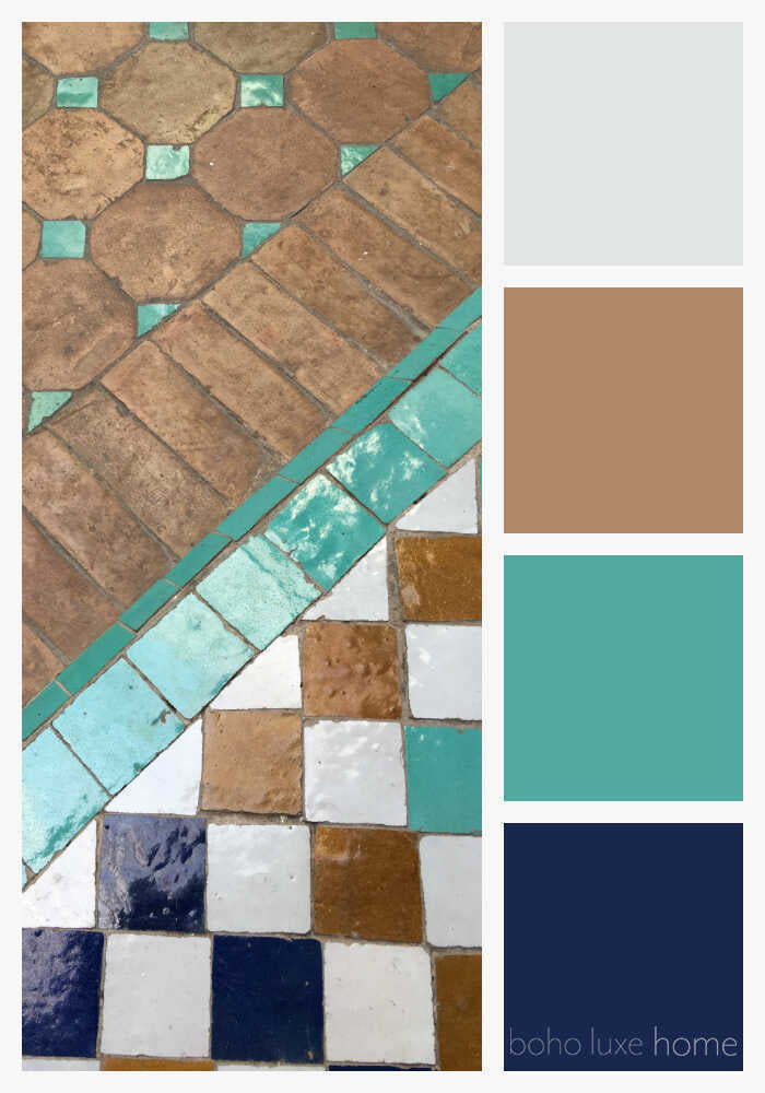
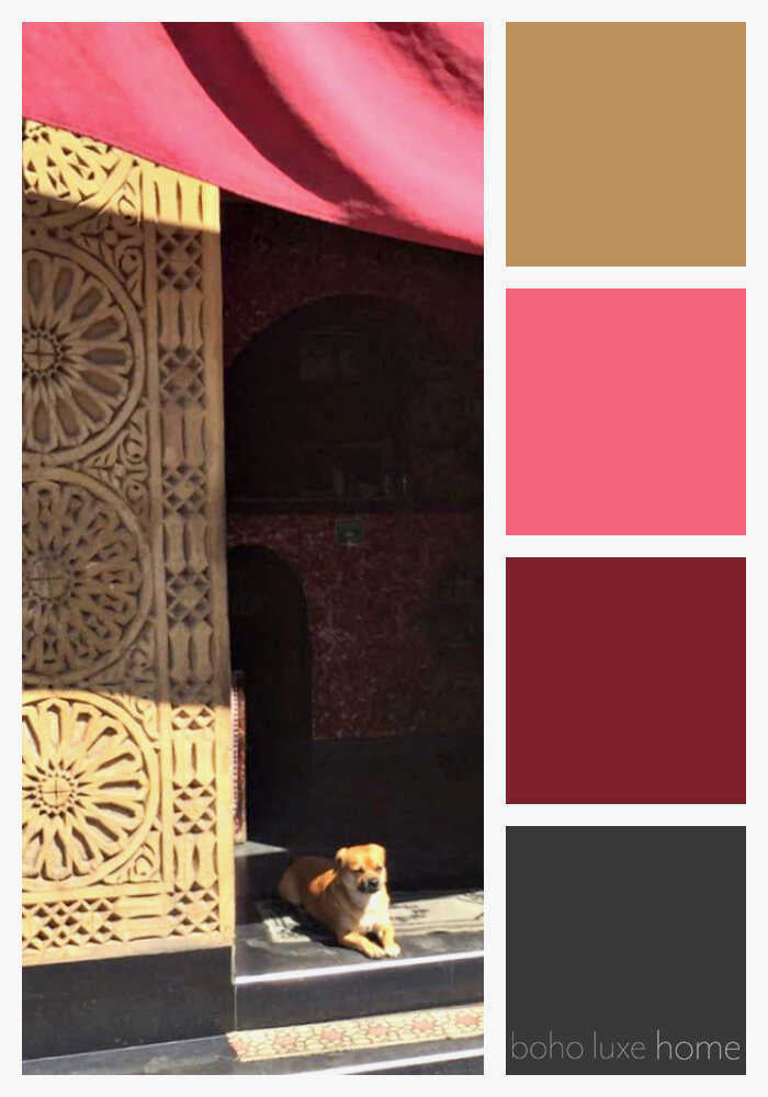
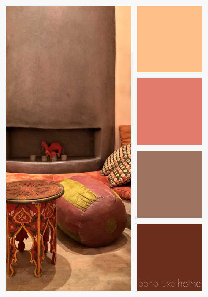
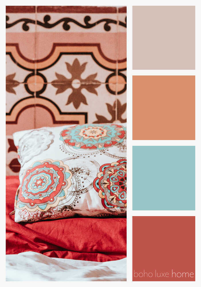
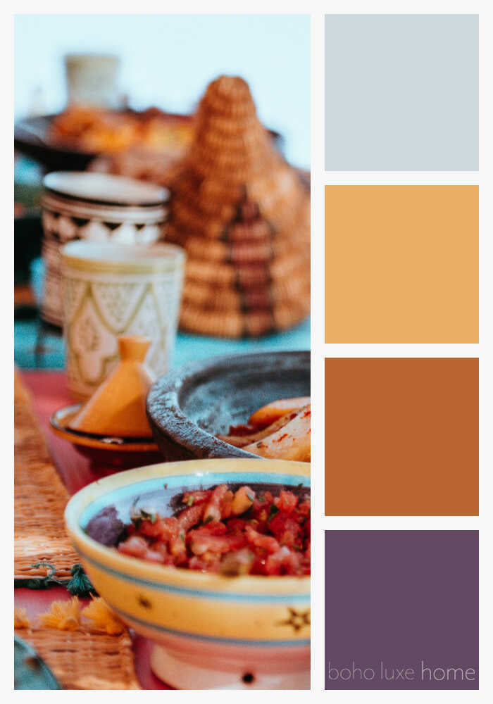
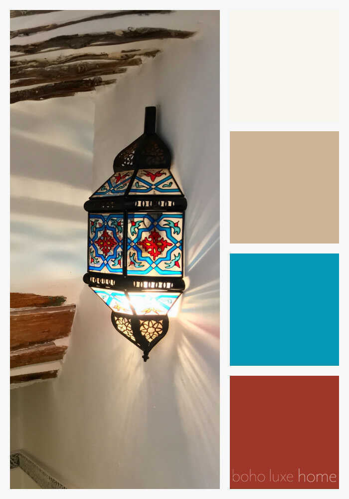
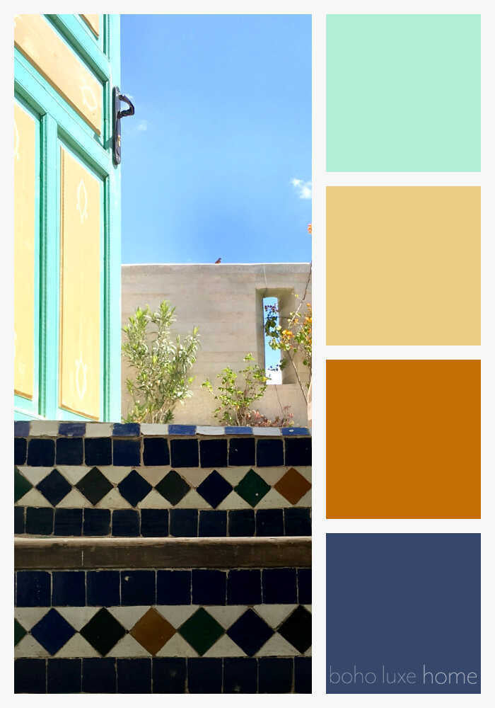
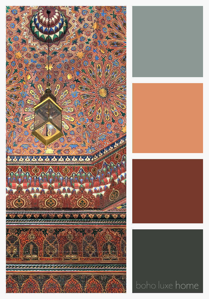
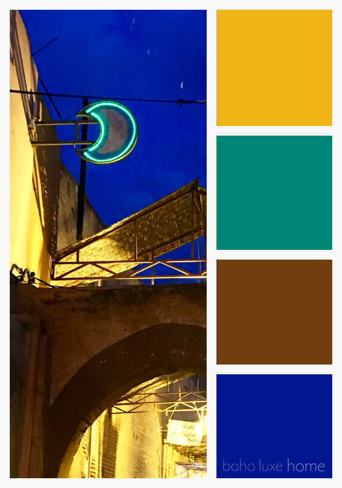
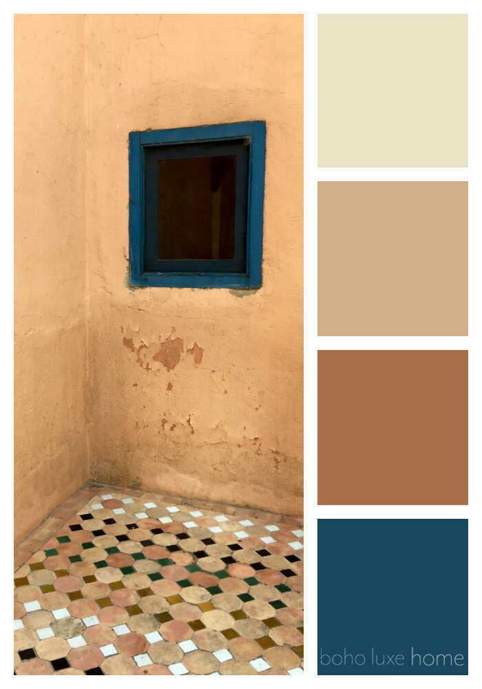
Travel has a way of sharpening our eye for color, and nowhere does that feel more true than in Morocco. From the moment you arrive, the landscape unfolds in layers of richly saturated hues — terracotta walls glowing under the sun, hand-painted tiles in endless geometric combinations, spice markets bursting with saffron yellows and paprika reds, and doors washed in deep indigos and faded teals. These colors aren’t accidental; they’re rooted in centuries of craftsmanship, climate, and cultural symbolism. Moroccan color palettes often pull directly from nature, echoing the tones of desert sand, mountain stone, lush palms, and open sky. What makes them so compelling is the way bold pigments are balanced with grounding neutrals, creating spaces that feel vibrant yet timeless. In our travels through cities like Marrakech, Fez, and Essaouira, we found ourselves constantly photographing walls, floors, textiles, and everyday details — not just landmarks — because each moment offered a new color story. These palettes tell a visual narrative of place, memory, and tradition, making them endlessly inspiring for designers, artists, and anyone drawn to expressive interiors. Whether you’re looking for inspiration for a home refresh, a design project, or simply a visual escape, Moroccan color palettes invite you to slow down and notice how color can shape mood, atmosphere, and emotion.
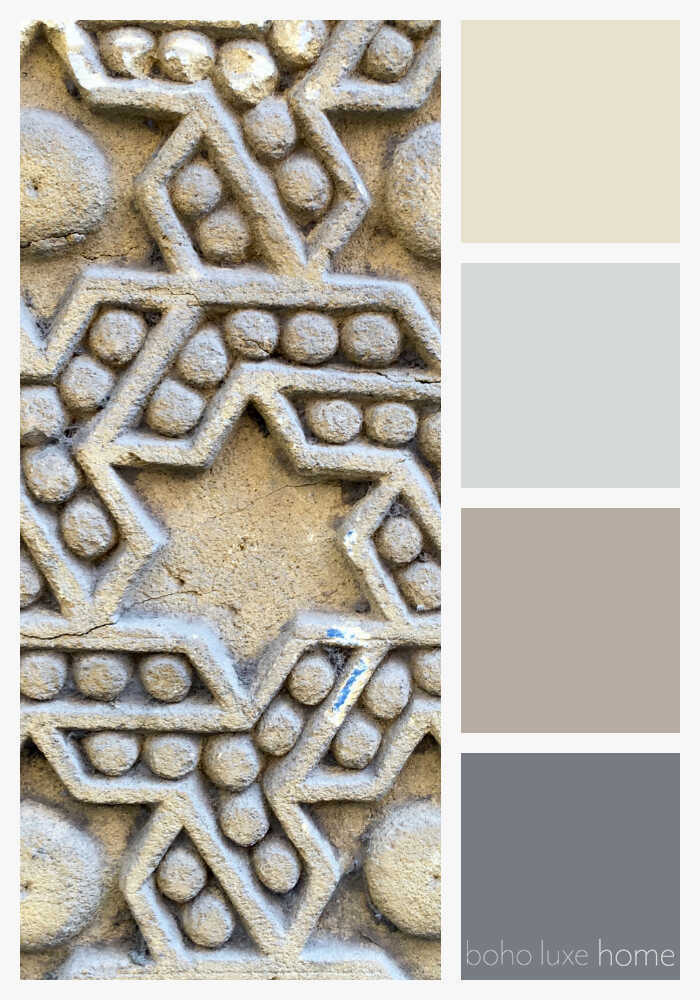
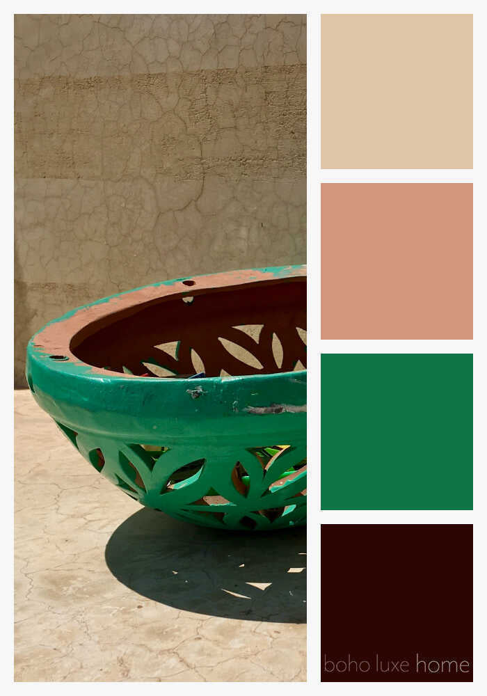
One of the defining characteristics of Moroccan color palettes is their fearless use of contrast. Jewel tones like emerald green, cobalt blue, ruby red, and amethyst purple often appear side by side, anchored by earthy shades such as clay, sand, charcoal, and warm white. This layering of color feels both maximalist and deeply intentional, reflecting a design philosophy that values abundance, texture, and craftsmanship. Intricate zellige tiles, for example, rely on repeating patterns and vibrant color combinations to create movement and depth, while hand-woven rugs introduce softer, sun-washed tones that ground a space. Even within a single city, the palette can shift dramatically — cool blues dominating coastal towns, while inland medinas glow with ochre, rust, and dusty rose. These color stories translate beautifully beyond travel photography and into interior design, branding, fashion, and art. Moroccan-inspired color palettes work especially well when you allow colors to coexist without over-editing, embracing imperfection and variation rather than seeking uniformity. The result is a look that feels collected over time rather than curated all at once. By studying these palettes, you begin to see how color can be both expressive and functional, creating spaces that feel warm, welcoming, and alive.
As you reach the end of this collection of 40 Moroccan color palettes, we hope it feels like a visual journey — one that captures the rhythm, warmth, and artistry of Morocco itself. These palettes are not meant to be followed exactly, but rather used as inspiration, inviting you to explore color with confidence and curiosity. Whether you’re drawn to sunbaked neutrals layered with indigo, soft pastels paired with earthy clay tones, or bold jewel hues grounded by natural textures, each combination reflects a way of living that values beauty in everyday details. Moroccan design reminds us that color can tell a story, evoke memory, and transform a space without feeling fleeting or trend-driven. As you incorporate these palettes into your own creative work — from interiors and textiles to styling, art, or mood boards — let them serve as a reminder to embrace richness, imperfection, and intention. Inspired by our travels and the places that left a lasting impression, this collection celebrates the timeless power of color to transport, inspire, and connect us to the world around us.
Want more color palettes inspired by our travels? Head here to view our inspiration from Japan!
Related product
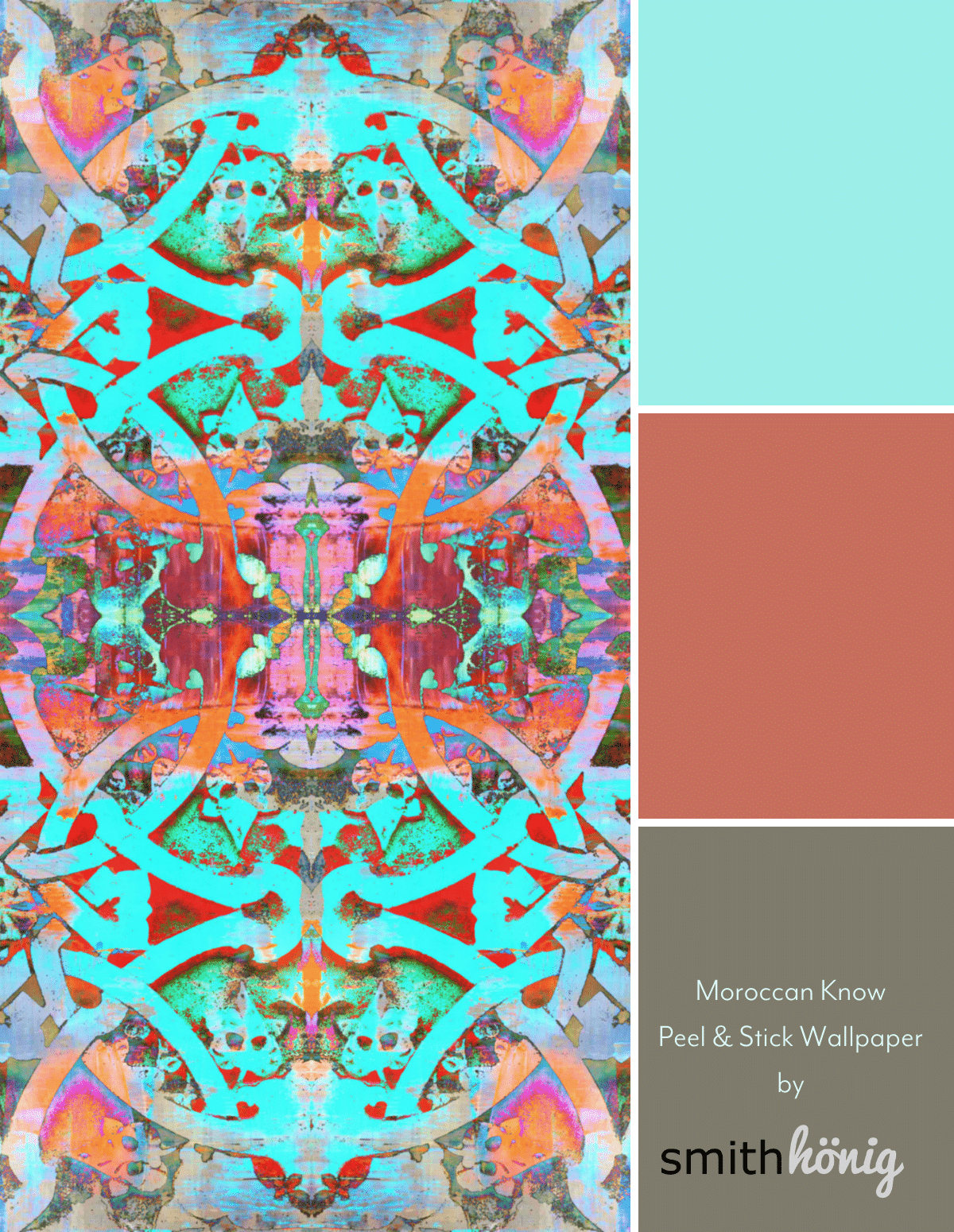
Peel and Stick Wallpaper - Moroccan Knot / Asilah
$156.00